Five things to consider when optimising for mobile search
This week’s blog is provided by guest writer Vlad Koval from Ahrefs.
Mobile search has been revolutionising the SEO world for several years now. Google recently rolled out their mobile-first index along with AMP (accelerated mobile pages) which led to a certain confusion among website owners and SEOs, as it was unclear how much it will affect the rankings and what needs to be done.
And seeing that the ratio of smartphone searches to desktop ones increases each year, a mobile-friendly site should be at the top of your priorities list. But what exactly does it take to create a mobile version of a site that not only complies with the recommendations by Google but also brings a huge amount of organic traffic?
In this article, we take a look at five key things to consider when you optimise your website for mobile search.
1. Responsiveness
Broken elements
First things first, responsiveness is something most of the website owners fail at. And it can be very challenging since you need to check if everything is intact on so many screens and resolutions. And it is still common to see a broken slider, unusable navigation, overlapping sections, and countless other issues. It makes the whole user experience an absolute disaster. Which means that your website will suffer a big loss in credibility in the eyes of your potential customers.
Not only does it scare people off, it can have a negative impact on your rankings since Google indexes and accesses your mobile version and, as many SEOs believe, also behaviour aspects such as dwell time. And even though Google might rank pages with responsiveness issues, chances are it will gain more significance as a ranking factor in the future.
So, don’t hesitate, grab your smartphone and check your site right now. Although, the more efficient way would be to use specialised tools, like Device toolbar in Chrome:
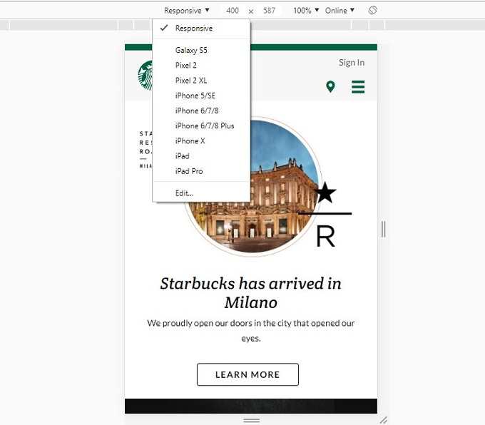
As you can see, you can choose between the most common mobile devices and test how your site appears on them. The tool is highly accurate and can be recommended. Note that Apple devices can render your site differently; make sure to compare Android and IOS views (and maybe Microsoft for that matter).
The same goes for browsers. Cross-browser compatibility has been a thing for a long time and is still one of the first things to check when optimising for mobile search. At the same time, it probably wouldn’t make much sense to optimise your site for every single browser. Focus on the most popular ones: Chrome, Firefox, Safari, and Edge.
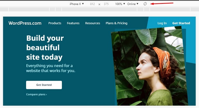
Another important aspect that you shouldn’t ignore landscape mode which is also used when browsing the Internet. Click the toggle button in Device toolbar to check that view:
Hidden sections
Mobile versions tend to have less information on the screen which is understandable. But sometimes it comes at the expense of the amount of content a page could have compared to desktop.
Google have explicitly said that both versions need to be equivalent and that includes images, videos, etc. It might be related to Google’s mobile-first index. According to that, the mobile version is prioritised for indexing by Google.
Viewport
Screen sizes are constantly changing. And you, as a site owner or an SEO, want to be sure that your site works equally well on each of them. And this is what viewport is for. Each of your pages must include a meta viewport tag which gives instructions to browsers on how to control the page’s dimensions and scaling.
If you are a curious, you might’ve seen one of those in source code:
<meta name=”viewport” content=”width=device-width, initial-scale=1″>
If it’s not set for some reason, the mobile browser will return the desktop version of your site. And this is unarguably bad user experience. You can find out more about it at w3schools.
2. Usability
When you are done tweaking your website to make it look fabulous on mobile devices, it’s time to move on to its usability. This part is less straightforward and usually requires more time to fix. How do you determine if your website is handy on smartphones? There are a huge number of factors that come into play.
Start with the basics, like font; its colour, size, boldness, and font family. Some things work for desktop, but turn out to be a bad choice on mobile. Ask someone to check your page with a fresh set of eyes and ask them if they experience any difficulties and where.
Don’t use more than six words on one line for mobile view. Otherwise, the text gets smaller and smaller making it harder to read. The more effort it takes to check your site, the less time your visitors will spend there. Here’s a great video on top 10 on-page SEO plays which includes tips for enhancing user experience.
Another thing to consider is your buttons. People tend to forget that mouse pointer is much thinner and smaller than a human’s finger. This is why buttons need to be spacious enough for us to be able to click on them. Here’s an example:

If you use any animations, like gifs or video, make sure they are playable but not set to autoplay. Best practice is to let the user decide to play the video or not.
Pop-ups
We have been talking so far about things that can improve your website, but there are some that are a big no-no. Some examples include huge newsletters or pop-up windows that cover the whole screen. They are also known as interstitials and can be a reason for penalising. There are three types of pop-ups that are deemed unacceptable by Google:
- A pop-up appears immediately after a user navigates to a page through search results and covers the screen
- A standalone pop-up that user has to dismiss before viewing that actual content
- A layout where the pop-up window is placed at the top, and the rest of the page is in-lined below it
But there are some ways that you can use pop-ups:
- Cookies or age verification banners, basically, legal obligation types
- Login dialogs where the content is not publicly accessible e.g. the content put behind a paywall
- Banners that don’t occupy much space and can be easily dismissed
Instead of bluntly shoving your message into visitor’s faces, try to find a more sophisticated way of delivering it. As a workaround, you can use in-text hyperlinks, CTA buttons, etc. Something less intrusive and more user-focused.
3. AMP
AMP, or accelerated mobile pages, is an open-source library aimed at loading mobile pages in a matter of milliseconds. You might not know that this is not actually Google’s initiative, but a project sponsored by them. There has been a lot of talk around whether this will boost sites’ rankings or not. And the main question is: do you need to create new, AMP-based versions of your pages?
Let’s start with some facts. Google officially stated that they index a non-AMP version of the page first. Which means this is not a compulsory change that everyone needs to implement. At the same time, it’s unlikely they support an idea that wouldn’t make any difference in how Google works.
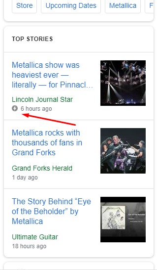
And AMPs do load pretty much instantly. This icon in the search results indicates that the page is powered by AMP:
However, you do need to sacrifice something to get that awesome page speed:
- Style sheets – first of all, AMP is a simplified version of your page which can make it look generic. Prepare to see plain text and images instead of the fancy styles you deliberately picked.
- Cache – one of the things that contributes to your pages loading faster is that Google uses a cached version of your content. It is delivered via CDN which makes tracking a lot harder than it used to be. And caching is a core part of the AMP system, so you can’t disable it.
- Backlinks – if someone finds your piece of content awesome and wants to link to it, the link will go to google.com. Because Google is the one that serves the content. As a result, you lose a potential backlink. Drawback? Definitely.
AMP is still a great step towards standardised mobile optimisation, it’s just that it’s not perfect and has some flaws to consider. But nevertheless, you can experiment with some of your content anyways to see if it works for you.#
4. Page Speed
Obviously, page speed is related to AMP and usability. But it’s such a huge topic that it deserves its own section. Especially, if you have a regular mobile page. Page speed, bounce rate, and dwell time together have an enormous impact on your rankings. And here’s what you can do to make your pages load faster:
- Hosting – no matter how hard you optimised your page the hosting will always be in the way of great speed results. Unless it’s top-notch and works at its highest capacity. You don’t necessarily have to buy the most expensive one; it’s more a question of what kind of CMS (or any other solution) you use. For example, Magento 2 websites are very resource-consuming and require a powerful hosting plan.
- Minified CSS and JS files – a simple but effective trick. Get rid of spaces between the lines of CSS and JS code so that the browser can load the files faster.
- Optimised images – images are the ones that usually take the longest to load resulting in additional seconds no one wants to wait. You can simply compress them to reduce the size.
- Use a caching system – again, this depends on the platform you chose for your site. WordPress users can try WP Super Cache plugin. Magento and Prestashop have their own built-in cache functionality. Find the best option for you and get the most of it.
- Redirects – too many redirects can cause a significant delay in opening your page. Try to get rid of them or reduce their number where possible.
On having implemented the optimisation tips, you might be wondering how well you did. You can test it with the Google’s PageSpeed Insights tool. The tool gives a speed grade for both mobile and desktop views along with some tips and hints on how to fix them.
Ahrefs’ Site Audit tool that helps you find on-site SEO issues of your site, has page speed report based on all the pages crawled within the project:
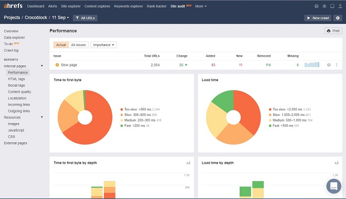
Run a crawl of your website, get a list of the pages with slow loading speed and fix them using actionable hints.
5. Schema Structured Data
Schema Structured Data is a universal semantic vocabulary used by Google, Bing, Yandex, and Yahoo! It allows the search engines to read the data on your site on another level and return it in a more meaningful way the on results page. This screenshot shows how much information you get just by looking at these product cards:
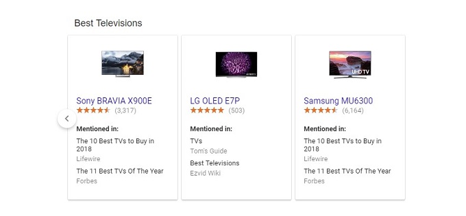
In this example there is an image, model series, ratings, and category. You might also see price, availability, product description and much more. Basically, you explicitly tell the search engines what types of information you have. But how does this benefit you? There are two main ways:
- Higher rankings – as you know, the goal of search engines is to serve the most relevant search results to a user’s query. If you help them make sense of your data, they can easier evaluate the relevance of your page and, theoretically, rank you higher
- More traffic – you get the advantage of showing more information at the very first stage of searching. Which means that you will more likely attract users to your site. It’s been known for a while now that features snippets get a lot of traffic
If you check the full tree of elements of schema.org, you will see that there are countless possibilities. It’s quite easy to get overwhelmed by them. You need to focus on things that really matter in your business and highlight them with the mark-up.
Final thoughts
Mobile search is an important trend in SEO and its future. If you don’t want to fall behind, you need to make sure you address every aspect of it properly. Start with the technical part and check your site’s responsiveness on mobile both manually and using specialised tools, like Device Toolbar in Chrome.
Then, test how handy your site is. You might discover some issues with fonts, pop-ups that you want to work on. AMP is a cutting-edge solution to slow mobile speed. You should at least consider it but keep in mind that it’s not perfect yet. Additionally, it’s worth going through the list of possible factors that can cause issues with loading speed. Like hosting, minified files, cache, etc.
Finally, schema structured data is a great way to enhance the look of your search results and generate more traffic. This is not something you can ignore if you take your business seriously.
At Artemis, we are specialists in optimising for mobile search and if you are interested in learning more please don’t hesitate to get in touch with us today.


